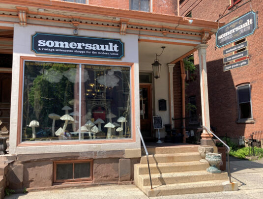
 In the picturesque mountain town of Jim Thorpe, Pennsylvania, lies a gorgeous and amazing gem…Somersault, an independently-owned letterpress studio and card shop! From their vintage presses, to their gorgeous retail space, to their beautiful cards, Somersault is unique in every regard. I’ll pause here while you enjoy their amazing Instagram.
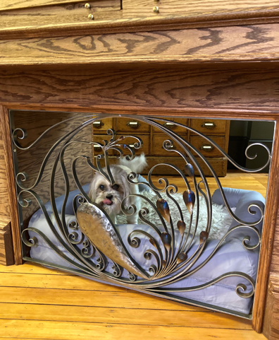
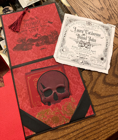 Owned and operated by Mitch Hanson and Amy Pienta (and adorably supervised by the Hammish, aka Hammie Noodle, seen below), what began as a side project in 2011 has bloomed into a multiple award-winning studio and retail venture.
How did this remarkable adventure start?
Believe it or not, our letterpress business began because we were planning on becoming farmers and cheese makers, LOL. We were spending our vacations on a friend’s farm learning about Icelandic sheep and how to make cheese, but everyone kept telling us we needed to do something else from the farm in the first few years of business to make money. In the meantime, we ran into an old acquaintance who was retiring their design + letterpress printing business. They did not want to sell to a commercial printer and hoped instead that someone would pick up where they were leaving off.
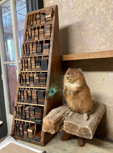
Naturally, we thought this would be a good fit for the farm venture. So we started learning about letterpress printing and running the business and instead ended up just finding our niche and falling in love.
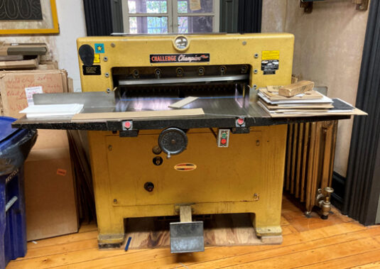
What types of presses/equipment do you have?
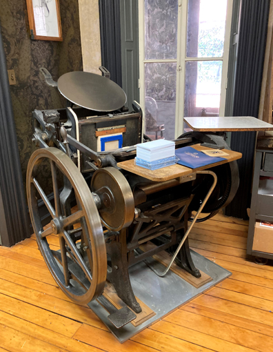
10×15 Heidelberg Windmills from the 50s & 60’s, one with hot foil stamping & 1 Chandler & Price 12×18 handfed press from 1932. We also have a small 5×7 Kelsey Pilot press (used for fun), a 1970s Challenge cutter, a stitcher, drill press, and photo polymer plate maker.
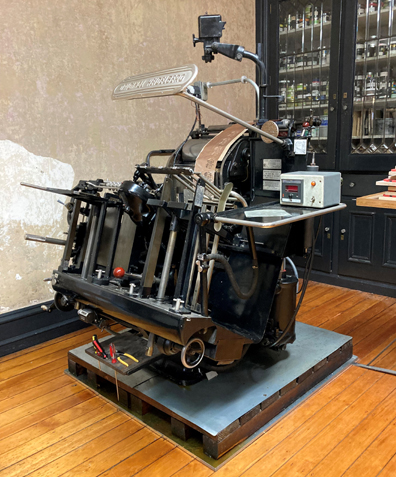
Please tell us about your philosophy on paper, products, and process…
We are not a traditional letterpress printer in that we are using carved lino blocks or lead type. Before we started Somersault, we were already working in the commercial print and design world and very accustomed to working with all different types of papers and processes, so naturally that habit just stuck with us. We use our vintage presses in conjunction with modern day design programs.
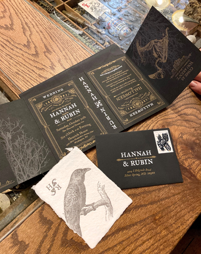
When it comes to paper, we love to push the envelope and try new things. When it comes to our clients’ projects, we feel it’s important for them to have products that tell their story in their own way, so we constantly strive for uniqueness. Using unlimited colors and textures and options allows us the artistic freedom we look forward to, and allows our clients to stand out in a crowd.
Why did you decide to relocate from Las Vegas, NV to Jim Thorpe, PA?
A culmination of reasons, really – a little tired of the incessant heat, one of us wanting to be closer to family after being in the desert for 15 years, one of us wanting to explore the East Coast for the first time ever, and A LOT of needing to be around four seasons again. Traveling from Philly to Wilkes-Barre to see family, we always took a detour through Jim Thorpe and when thinking about places we’d like to live and have a retail space (we didn’t have retail in Las Vegas – just the studio), Jim Thorpe kept coming back to mind.
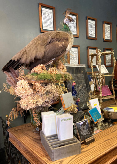
What’s one unexpected thing about working with vintage equipment?
Almost everyday we’re blown away by the engineering of these awesome presses and their versatility to print, foil, emboss, deboss and die cut on everything from super thin rice paper to triple thick cover stocks – even plexiglass and leather – over and over and over again. They are both heavy beasts with pressure and at the same time very delicate delivering precision with nothing but iron and steel… no circuit boards, or rebooting, or service calls needed… and if something isn’t printing correctly, it’s ALWAYS operator error.
 You have an incredibly interesting and unique space. Please tell us about one of your favorite objects in your store or studio!
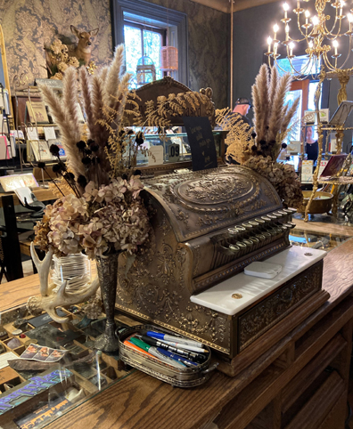
Our favorite object in our studio is our front counter – hand-built by the two of us – and seemingly the heart of the retail space. We wanted a unique way to highlight collected mementos and small pieces of our work in California type cases – yet never quite expected it to become such a communication tool. Friends and neighbors have brought items to be shared for the case, visitors have left foreign currency or little bits of their travels, and patrons are constantly fascinated by what they find there and feel compelled to share their own stories. Connecting with people across the counter in such a way has made the shop feel even more like home.
What’s one of the most challenging projects you’ve completed?
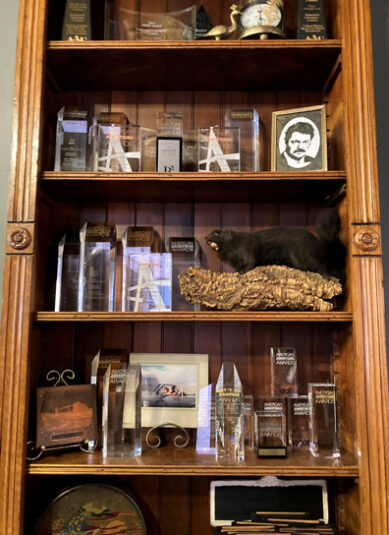
The most challenging in scope had to be the Bejeti Wallet media kit boxes. Working with an agency in Harrisburg, we developed and engineered a small multilayered box with a magnetic lid. The project involved producing die-cut insets and inserts that were hot stamped with holographic foil on a soft-touch black stock, embossing, hand assembly – all to showcase a piece of actual meteorite sitting prominently on a small magnetic stem. For our small studio, it was an intense amount of engineering and labor but it all paid off in the end – the project just won a national award for GDUSA’s Packaging Competition.
Please finish this sentence…if there’s one weird thing I’m obsessed with at work, it’s…
On a constant daily basis we are obsessed with the wonderfully weird phenomenon of watching an idea – literally conjured up out of nothing – transformed into this remarkable, tangible product. Watching this perfectly modern and beautiful piece come together on these old presses is like watching magic happen. We never get tired of it.
Many thanks to Mitch Hanson and Amy Pienta for allowing me to photograph their shop and studio!

 Thought these might come in handy for your summer reading “Universe of Stories” theme…with a historical twist!
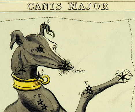
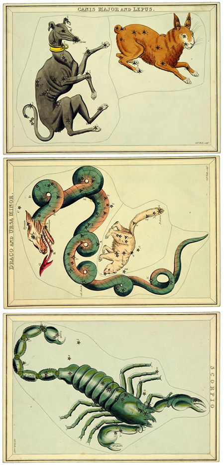 Did you catch that the 3 cards I pulled from the deck are Harry Potter references? Sirius, Draco, and Scorpius, respectfully. So a little stargazing, a little history, a little literacy, and an awesome bookmark for your summer reading books to boot.
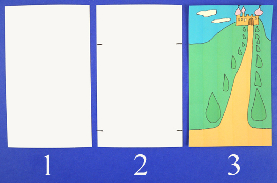
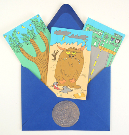 A shifting map full of flying horses, hungry demons, mystical landscapes, and the New Jersey turnpike? This could only be a project for
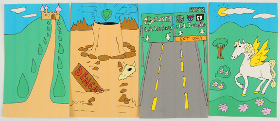
 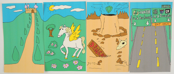 Myriorama cards, which debuted in 19th century Europe, are these cool little decks of cards with matching skies and horizon lines (I review of a modern deck of myriorama cards in
  You’ll need:
 For our story time activity, I gave each kid a colorful envelope bedecked with a silver
 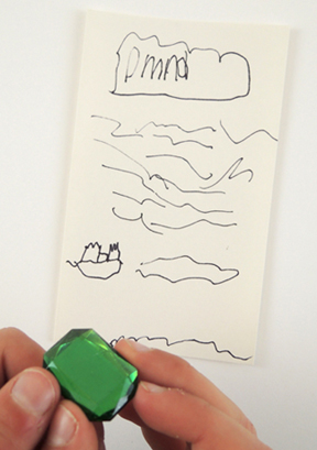 If you’d like the myriorama cards I drew, you’ll find the black and white template