 It doesn’t matter if you are yellow, red, green, this, that, rather, or neither. Just be YOU!
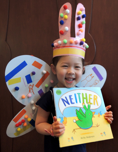
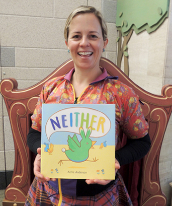
We read Neither by Airlie Anderson (Little, Brown, 2018). Neither the green bunny bird doesn’t fit into the tidy world of blue “This” bunnies or yellow “That” birds. Not rabbity or birdy enough, Neither is asked to leave. After a long flight, Neither lands in The Land of All, where creatures of all kinds live and play happily together. In The Land of All, everyone is welcome. And yeah, this book totally ROCKS!
We were sooooo excited to have author and illustrator Airlie Anderson visit our library for a fabulous story time. There’s an interview with her after the project part of the post. And after that? We’ll be giving away 3 signed copies of Neither to lucky blog readers!
You’ll need:
- Poster board
- Elastic string
- Costume decorating supplies (more on this below!)
- Scissors, tape, and glue for construction
- Markers for decorating
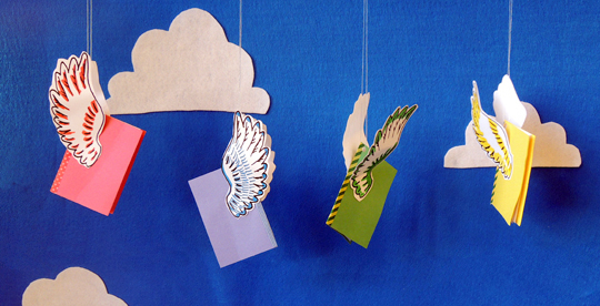
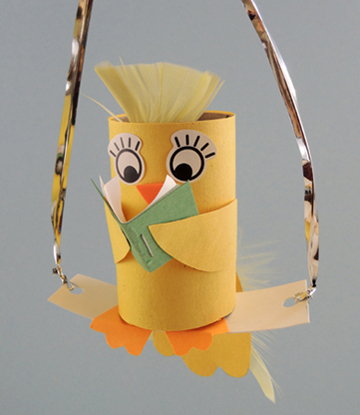
We kept the construction of this project simple – ears and wings – so kids could dedicate all of their time to decorating. While you can easily make wings out of poster board, we decided to test out the “Colorations Decorate Your Own Wings” from Discount School Supply (set of 12 is $20). The wing span is 22.5″ wide. Here’s a poster board version so you can get an idea of the shape:
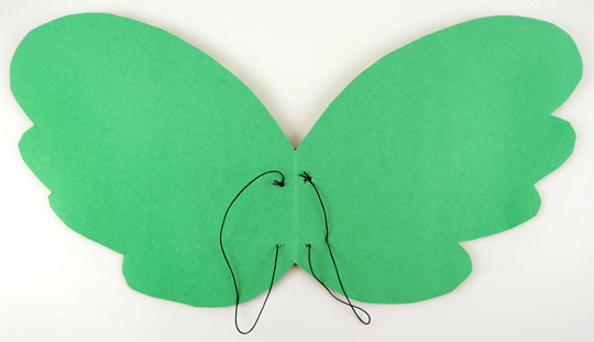
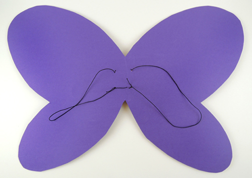 You can also see how the wings are rigged with loops of elastic cord, so the kids can just slide them on like a backpack. If butterfly wings are not your cup of tea, you can easily turn the butterfly wing shape into bird wings like so…
The ears were a simple poster board head band with whatever ears you would like. As you will soon seen, bunny and kitty ears were very popular, though we did have a couple unicorns. We also has tails the kids could tuck into the back of their pants, or attach round their waist with elastic cord.
When your wings, ears, and tails are selected, decorate! We offered metallic , sparkle stems, pipe cleaners, pom-poms, construction paper, self-adhesive foam shapes, crepe paper streamers, iridescent ribbon, color masking tapee, and the Bling Bin! Airlie also walked around, Sharpie in hand, to customize wings and headbands:
This slideshow requires JavaScript.
I caught up with the amazing Airlie Anderson after story time, and asked her a few questions…
 Please tell us a little about yourself!
Hi everyone! I’m Airlie, named after my grandma whose parents were Scottish. I was born and raised in California, and now live just outside of Princeton, New Jersey. I love it here! Except when it’s humid.
I was that little kid who was always drawing, and just never stopped. One of my favorite things to do is to sit in a busy café and draw in my sketchbook. My studio is in a sort of hallway in our house, so I can work while our 2 year old son naps.
How did the concept for Neither first occur to you?
I had a dream about an animal that had a mix of characteristics, and in the dream I thought, “This should be a book, and it will be called Neither.” At the time, I was teaching art to a class of middle school students, and they were just so inspiring. That dream was definitely influenced by them!
When it came to designing the main character of Neither, there were so many animal combinations to choose from! How did you finally arrive at the bird bunny?
In my Neither Dream, the character was mostly cat and butterfly, and it was a grey color. But when I experimented with sketches of that character, it looked too precious, so cute. I wanted it to look slightly more awkward, with clear qualities of two different easily recognizable animals. So bunny bird it was! Also I felt that I could make the bunnies blue for some reason, and the birds could be yellow of course. Then Neither would be boldly green. It felt just right.
The colors in this book are gorgeous! What medium did you use to create it?
Oh, thank you! I used gouache, a super saturated an opaque watercolor. It reproduces nicely, doesn’t it? I like to sketch on regular ol’ printer paper and then use a light box to trace each drawing, with paint, onto watercolor paper. Then I put lots of layers of gouache on. Green is a tricky color to reproduce, though, especially Neither’s bright lime green coat. So the excellent people at my publisher suggested an extra ink in the printing process that would make that beautiful shade of green. I was thrilled by this news, and it turned out just delightfully.
What sort of feedback have you received about this story?
Oh, I have received the most wonderful messages about Neither, from people of many different ages and backgrounds. I recently received an email from a fifty-five year old gentleman who works in an LGBTQ community center in Florida, who said the book made him cry happy tears. I hear from parents of children who don’t feel they fit in, and they tell me how Neither is their favorite bedtime book. These messages mean the world to me — the thought of people sharing this story and having a lovely experience because of it is wonderful.
I heard a rumor that Neither is going to be made into a musical! Is this true???
Yes, oh my gosh!!! What a dream come true! Lifeline Theater in Chicago is producing Neither as a musical, to premier in the spring of 2020. Coincidentally/magically, the person writing the stage version has recently moved from Chicago to Princeton and works with mutual friends — so we get to share ideas over coffee!
What are you working on now?
I have two picture book sketches with my agent right now, one about the Easter Bunny and one about sea creatures. I’m also working on a graphic novel, which is a total passion project and has been shouting at me for years to be written. I’m finally listening!
And now it’s time for a FABULOUS book giveaway! We have 3 autographed copies of Neither (Little, Brown, 2017) to share! Just e-mail cotsenevents@princeton.edu with your name, and the initials of someone you think is unlike any other. We’ll put all the entries in a hat and draw 3 winners at random on Tuesday, July 2nd. Good luck!


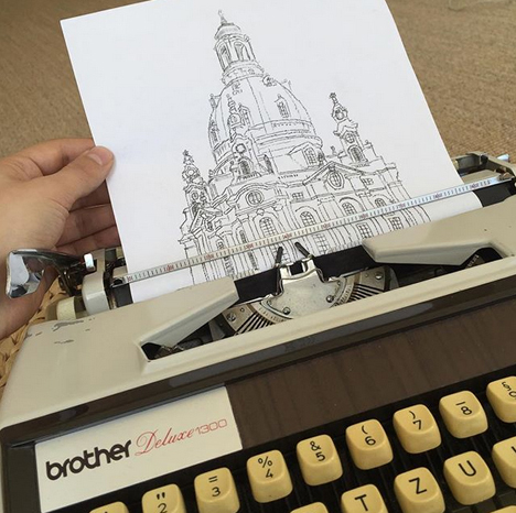
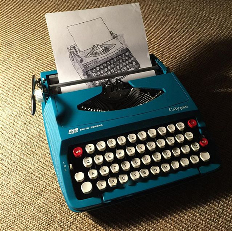 Daily, we lay our fingers on our QWERTY keyboards. But while we type out words, German artist Robert Dörfler conjures portraits, buildings, animals, and landscapes. An artist with a mechanical easel and alphabetic brushes, his
 But one day I came across other specimens of the older typewriter art again and realised that there might be some logical connection between the two styles, figuring that some ASCII art techniques could be applied to the typewriter, and I could apply what I had learned from the newer style to the older… with mixed success. Of course, the paper page isn’t limited to columns and rows the way a fixed-width screen of text is on a computer, so you can still manage to go outside of the box and push boundaries outside a strict grid even typing with straight lines.
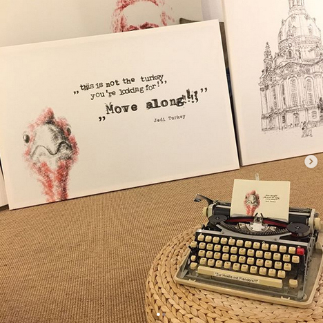 Typewriter drawing can feel like you’re using some analogue Photoshop with layers and a wide range of colours, except of course without any “undo” function for erasing mistakes that might come up.
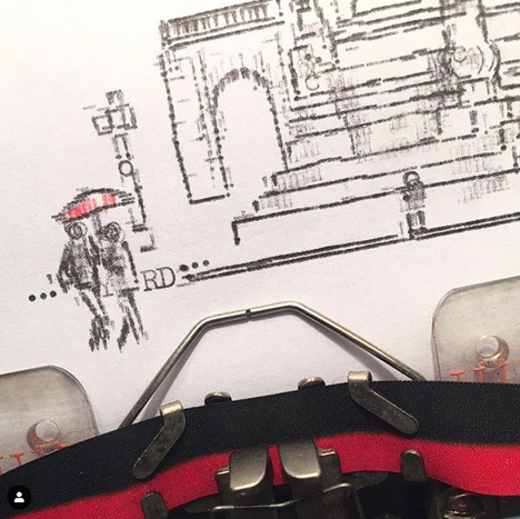 How do you translate landscapes and buildings to typewriter keys?
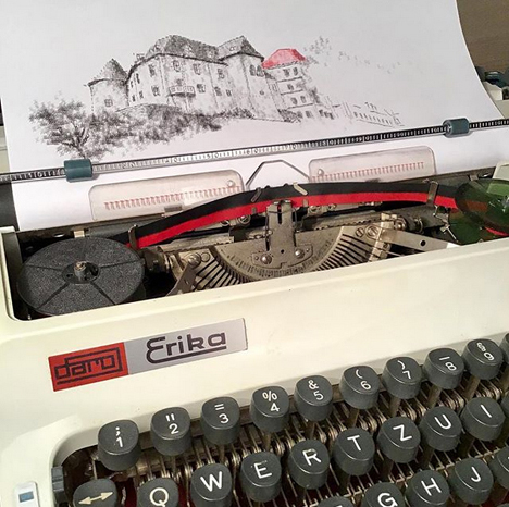 What is the most difficult thing about creating a piece?
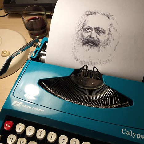 What brands of typewriters do you use?
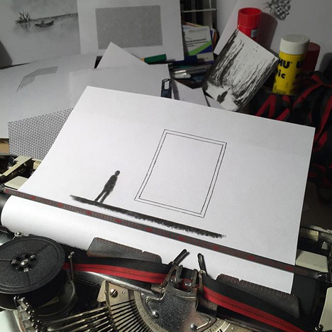 Name your top 5 typewriter keys to use, and tell us why!