 This fall, Abrams ComicArts released The Art of Nothing: 25 Years of Mutts and the Art of Patrick McDonnell. And while this is a wonderful opportunity to enjoy 25 years of the much-loved comic, what truly radiates from this book is the philosophy of Mutts and its creator, Patrick McDonnell.
 Granted, “philosophy” is an unusual word to use to describe a daily comic. But longtime fans will immediately nod their heads and smile. As Patrick himself writes in the preface, “Since I try to see the world through the eyes of animals, most Mutts themes are quite basic: dogs, cats, snow, rain, the moon, the ocean, and what all animals (including us) want: food, naps, and love. And, because all art is personal, other themes explore the language of comics, the high art/low art discourse, the human-animal bond, the environment, animal rights, and spirituality.”
In short, Mutts is a beautiful philosophy of simplicity, compassion, and consideration.
At its very essence, Mutts is an assortment of souls who care for one another, play together, and advocate for others. The characters are often drawn on minimalist backgrounds, which enhances the purity of their interactions. Love and laughter. Inspiration and gratitude. The Art of Nothing both reaffirms and elevates these concepts. The book prominently features our beloved Mutts friends, but it also includes Patrick’s free-style art, his creative nods to artists who inspired him, his dedication to animal rights advocacy, and his growth into other areas of creativity, including his Caldecott Honor book, Me…Jane.
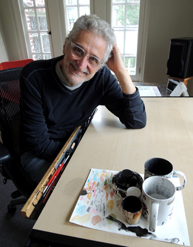
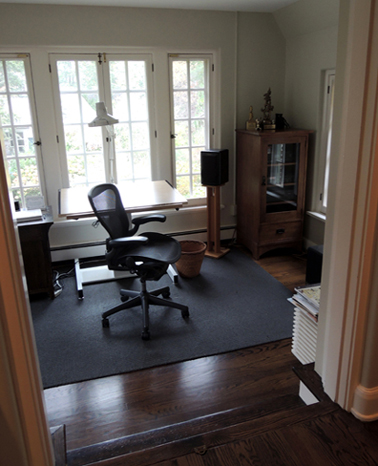
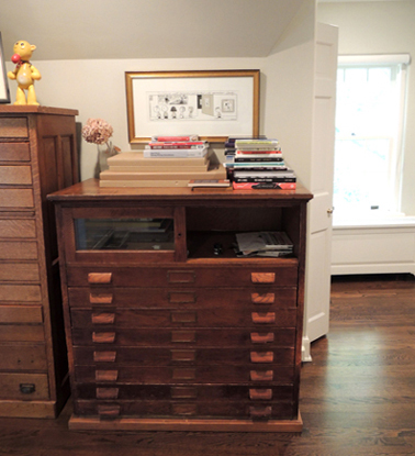
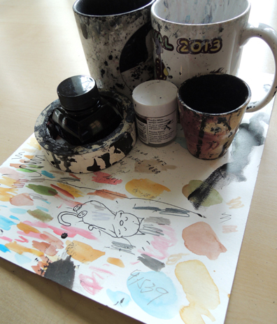
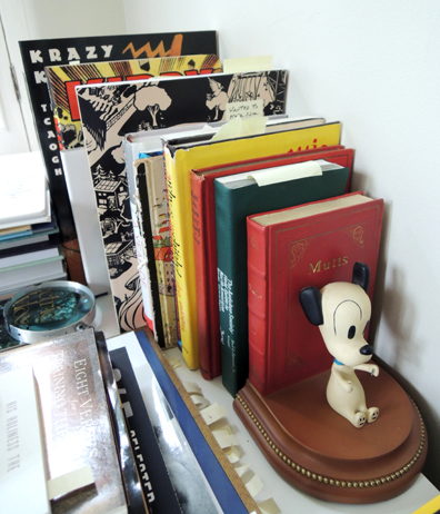
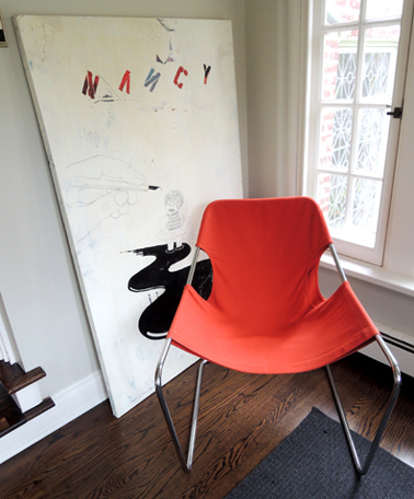
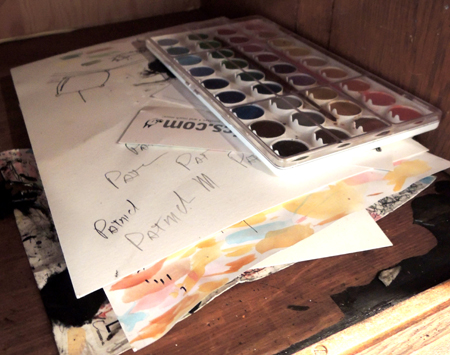
Recently, I was both delighted and honored to interview Patrick in his home studio. Artists’ work spaces are always interesting windows into their processes – Patrick’s studio was exactly like stepping into one of his Mutts panels. Minimal, comfortable, and with a distinct feeling of positive intent in the air. Oh, and there was an energetic terrier running around the house with a squeaky toy, as well as a glorious tabby cat lolling under a chair.
The title of your new book, The Art of Nothing is both a play on your first Mutts picture book and the process of a daily cartoonist. In the end, it’s about giving yourself, fully. On that note, can you tell us about the final pages of the book, the illustrated correspondence with cartoonist Lynda Barry?
I’m a big fan of Lynda and her work and had the pleasure of meeting her several times over the years. She was very close friends with my first editor at King Features comic strip syndicate. Charlie Kockman, my editor at Abrams, thought we needed an interview for the front of the book, and he suggested Lynda. But she had a really interesting idea…she didn’t want to do a conventional interview. She proposed that we be pen pals and do an interview via letter writing.
So over the course of three months she would write to me and I’d write back. She’s a teacher, so she gave me assignments. I felt like I was in high school again. I thought, and hoped, when she was done it would be a combination of her letters and my letters. But as you see in the book, she ended up putting together a collage of my letters and “homework.” It was a fun, intimate way of communicating. It came out really nice. Lynda’s a genius.
 Yes, it was unusual in that it was non-linear and very open-ended…definitely not an interview format I’ve ever seen before! In fact, the entire format of The Art of Nothing really surprised me. A daily comic is very fixed…certain panels, certain rules, certain deadlines. This book unwinds those restrictions and let’s everything flow together – the comics, your original artwork, your thoughts, your collaborations…
Thank you. You know, when I look at the book, I feel like I’m like looking at not only the last 25 years of my creative life, but also inside the part of my brain that makes Mutts.
Charles Schultz, creator of Peanuts, is often cited as inspiring your cartooning career, and your new book is filled with your personal artistic tributes to N.C, Wyeth, Vermeer, Jasper John, Chester Gould, Jack Kirby and so many others…can you tell us the most recent artist you encountered who changed the way you look at your own art?
I recently visited the James Thurber House Museum in Columbus, Ohio. Afterwards, I started looking at his work again. I’m drawn to artists who give you license to be free, and he definitely does that so elegantly – to not worry about embellishments, to just get to the heart of something. Through his art he gave me additional permission to be even looser with mine.
 Over the years, both Mutts and your own life path have evolved to include animal rights advocacy. Were you ever surprised about where that journey has taken you and your characters?
It’s been an interesting journey. When I started Mutts, it was important to me that I kept my characters animal-like. The inspiration for Mutts was not only my love for comics, but my love for all animals. In particular my love for my first dog, Earl. I had wanted a dog ever since I was a kid, probably because I was in love with Snoopy from Peanuts. It took 30-something years, but I finally adopted my dog, a Jack Russell named Earl. He was everything I dreamed a dog could be. He was the inspiration for the comic. I felt if I could capture his joy of life and his spirit, I was doing my job.
Anyone who has a pet knows they’re funny. They don’t have to act like humans. They have their own personalities. I was trying my best to see the world through their eyes, and the more I looked, the more I started thinking how tough it is on this planet for other animals. In particular, I was thinking about the dogs and cats that are in shelters waiting to have Earl’s and Mooch’s lives in a forever home.
So I started playing in sketchbooks with ideas of shelter stories that I could tell in my strip. And around that same time the Humane Society of the United States got in touch with me about Animal Shelter Appreciation Week. I thought it was a perfect opportunity to share the shelter stories I was creating. That started the Shelter Stories part of the strip.
 That led me to think more and more about the world and animals. When I joined the Humane Society’s board of directors, I learned so much more about how tough it is for animals on the planet. And that became integrated into the strip. Mooch and Earl helping farm animals, Mooch dreaming about Africa, and Shtinky the tabby, who became my animal advocate and took on the mission of trying to save tigers from extinction. Shtinky is able to help me introduce bigger issues related to animals.
So yeah, when I started this strip, I didn’t think it was going to evolve this way, but I’m really happy it did. Animals need someone to speak up for them. And it’s become a big part of my life and a big part of this strip. And I feel that any little help I can do is probably the reason I’m here.
 Please explain the derivation of Mooch’s “little pink sock.”
You know what’s funny about that theme? I get lots of pictures of people’s cats with little pink socks. I didn’t realize that was something cats love, but I learned it is. It began as a story line for one week. But it just fit so well with Mooch’s personality it became one of the themes I go back to regularly. Cartoonists have different devices we use – the little pink sock is one of them for Mutts. It seemed perfect that Mooch would be obsessed with a little pink sock – just the way real life cats do I’ve learned.
You’ve written 12 picture books, including Me…Jane which was a Caldecott Honor winner, as well as co-written two musicals and a screenplay for a feature-length Mutts animated movie. How, if at all, did these endeavors challenge your creativity?
I’ve enjoyed all of it. The comic strip – not that it’s a grind, but it stays pretty much the same artistically. Not the storytelling and the jokes, but the process. And it’s also just me, every day, just me with my dog sitting right here next to me. That’s about it.
But I love doing the plays. To collaborate with Aaron Posner, who’s a great director and playwright, and Andy Mitton, who wrote the music…it’s so nice to have a new family for a length of time. And creating something together, and to see it come alive on the stage was just so much fun. And theater is very similar to comic strips…
Really? How so?
They’re dialogue-driven, and they kind of stay in the same place. When you think about most comic strips, the setting is basically just a few defined areas. Comic books are great for movies because comic books are big stories with dramatic visuals. But comic strips are very quiet and kind of personal. And that’s like theater. The scenery stays largely the same…and it’s mainly dialogue and character driven. I love the theater. I had the chance to do The Gift of Nothing and then Me…Jane at the Kennedy Center and we’re hoping to do another musical someday soon.
The only unsettling thing with Me…Jane was that Jane Goodall was there on opening night. I have utmost respect for her and her mission and wanted her to love it, of course. I sat next to her at the performance. As the play was unfolding, I looked every once in a while to make sure she had a smile on her face. She was pleased with it, which was thrilling for me. But believe me. It was also very nerve-wracking.
 What’s your guiding philosophy for the next 25 years of Mutts?
My, hero Charles Schulz, did it for 50 years. Based on that, I’m only halfway done. That’s a scary thought.
What’s interesting about doing a comic strip – it’s one-day-at-a-time. It’s not like writing a novel, where you have to plan everything and figure out how it’s going to end and what the plot twists are. Doing a daily-comic strip is more like life…you just take it as it comes one day at a time. So other than continuing that process, I’m hoping the Disney animated movie might happen. That’d be a new world to explore with the characters.
I’m still planning to write more picture books, and I have dreams of doing a graphic novel. I might try that next year. The limiting factor is time. Doing a daily comic strip takes up so much of it. I wanted to be a cartoonist because of Peanuts since I was four years-old. That was my dream job. But I never thought of the reality of the job. I never thought, Oh, that’s every day for the next 25 years. It didn’t really hit me until I started doing it. Then I realized. It’s like a term paper that never ends!
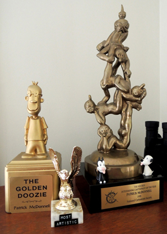 Also, you know, it sounds corny, but the characters, to a certain extent, do write themselves. You live with them so long, and you know their personalities. I think visually. When I think of new ideas, I’m literally just sketching funny pictures that make me laugh. So I think, where can I put them where they haven’t been in a while? If I draw Mooch somewhere new, I know how he would react and what he would say. That helps.
With a daily comic strip you’re not allowed to have writer’s block. Somehow, you have to have a lot of faith that it will get done. And so far, it has.
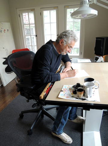
We’re giving away a signed copy of The Art of Nothing to a lucky blog reader! Just e-mail us with your name, and the name of your favorite Mutts character. And…the winner has been selected! Thank you everyone who entered, from Idaho to Puerto Rico!
Many thanks to Patrick and his wife Karen for graciously inviting me into their home, and thank you for 25 years of Mutts…the love, the laughter, and the little pink socks.

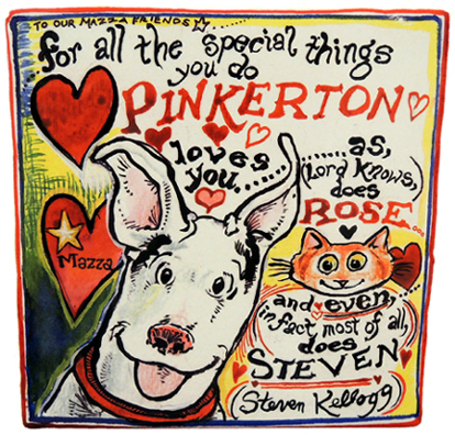 Even though winter is almost here, I’d like harken back to the golden days of July and share a trip I made to Findlay, Ohio this summer. The purpose? To teach two creative workshops at The Mazza Museum of International Art from Picture Books’ summer conference.
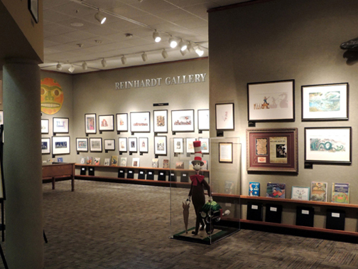 The main gallery is absolutely packed, almost from floor to ceiling, with children’s book illustrations.
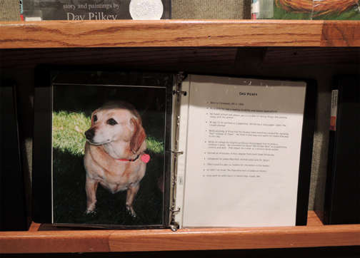
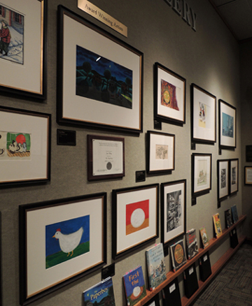 Notice the little black binders near the floor? That’s information about the different authors on display, along with reading copies of the book. Such a terrific idea.
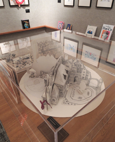
 My favorite display, however, was a small side gallery containing displays of pop-up books.
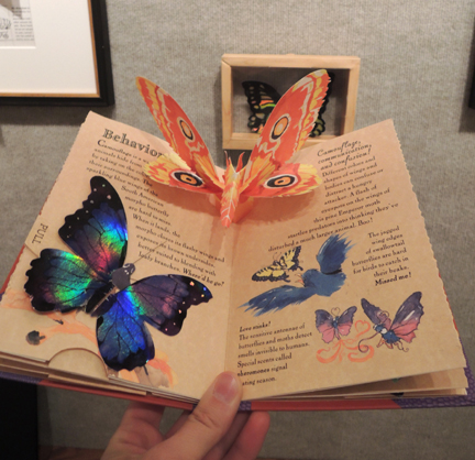
 Like the main gallery, there were plenty of reading copies on hand. Here’s the Young Naturalists Pop-Up Handbook of Butterflies by Matthew Reinhart and Robert Sabuda (Hyperion, 2001).
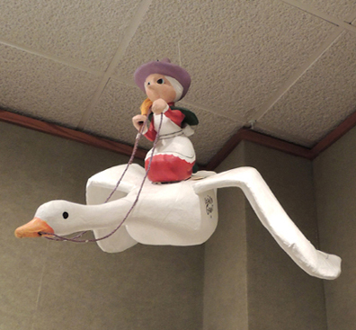
 Back in the main gallery, there are some terrific whimsical touches. Like this Mother Goose flying from the ceiling:
 And an Owl and the Pussycat sailboat docked on the gallery floor!
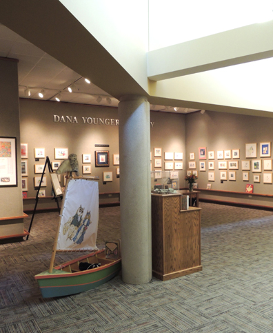 Did you notice the natural light filtering down in the above image? The central gallery has a large skylight that is partially blocked by an extensive loft area. Inside that light-filled loft is the MOST AWESOME PLACE EVER…a children’s space!
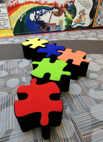 Here, you’ll find plenty of comfy, kid-sized seating and a number of hands-on activities.
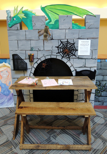 There’s a building table, a wall of gears, word games, drawing activities, some felt boards…and do you recognize this iconic library with the lions?
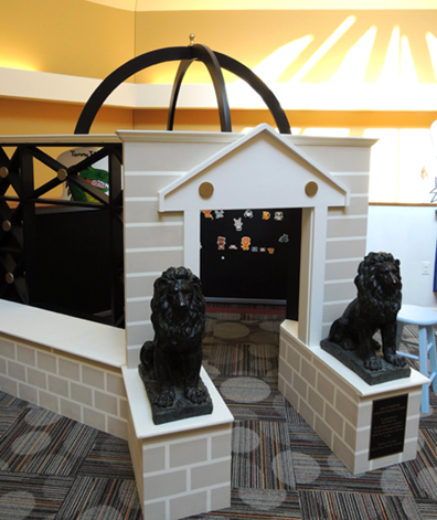 To exit the loft, you could take the stairs back down. Or, you could nip into the rabbit hole…
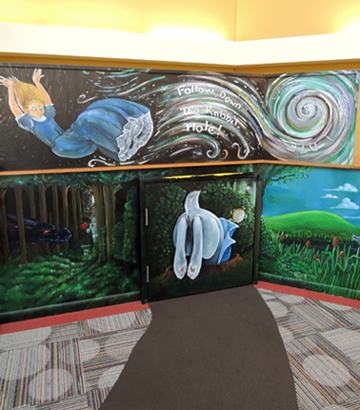
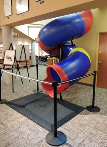 Elsewhere in the building is an art studio for kids, a teacher resource center, multiple display of children’s artwork, and a gift shop with a big central area that encourages extensive browsing.
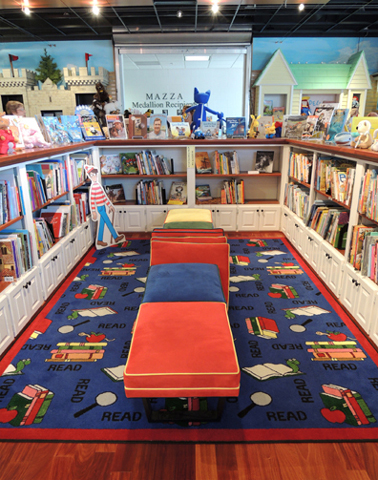 In the gift shop, I found a book so ingenious, I swear we have to do this for the
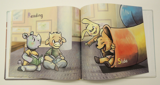
 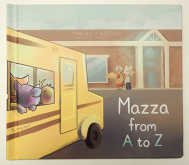 A class of adorable animals visit the museum and makes their way through the ABCs of visiting. Guess what the letter S is?
 But the very best Mazza treasure I saved for last. Deep within the staff offices is a conference room filled with original illustrations, sketches, and notes from children’s book authors and illustrators.
 Every inch of the wall is covered. It’s amazing to think of the talent that has stood in this very room, Sharpie in hand, sketching on the wall.
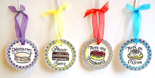
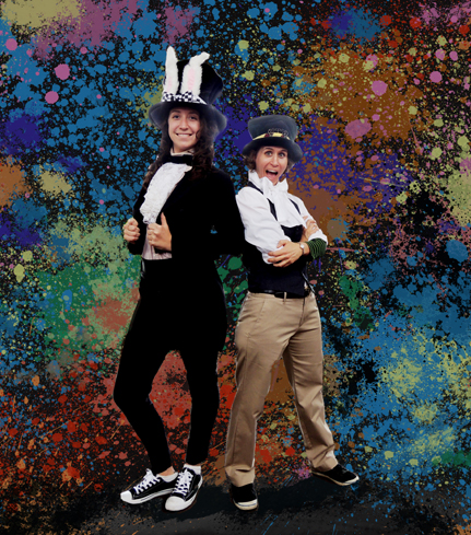
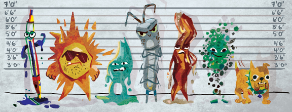
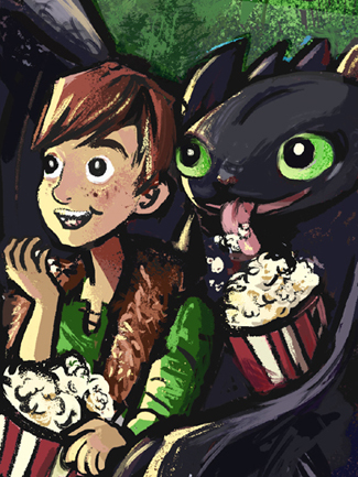
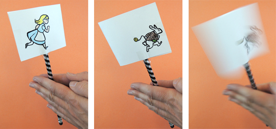
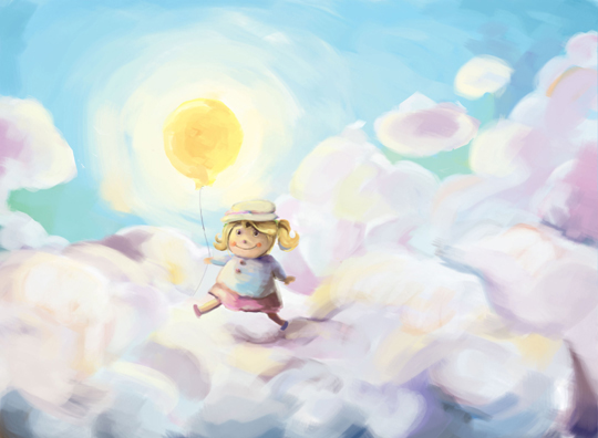
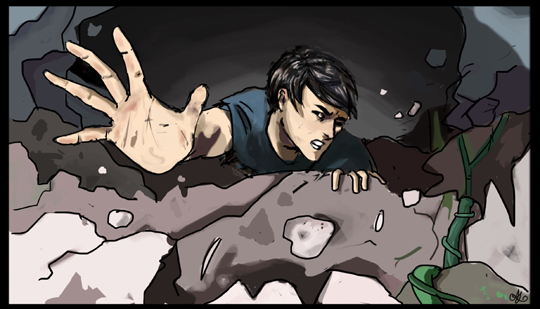
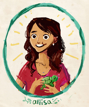 For the past four years, I have had the privilege of working with an extremely talented Princeton University student artist. Her name is Aliisa Lee, and she has loaned her tremendous abilities to a whole host of artistic endeavors at our library – project templates, event posters, logos, illustrations for children’s stories and poetry, and more.
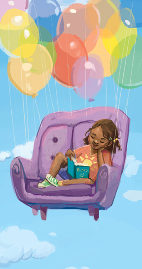

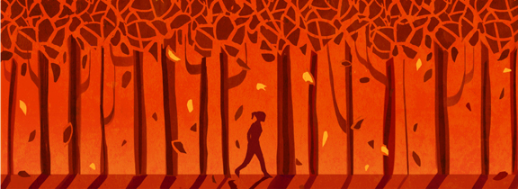
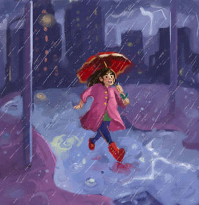
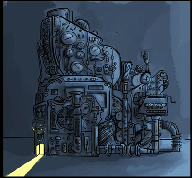
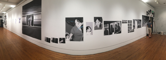
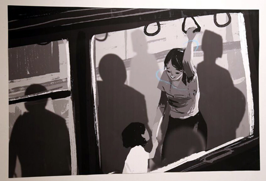
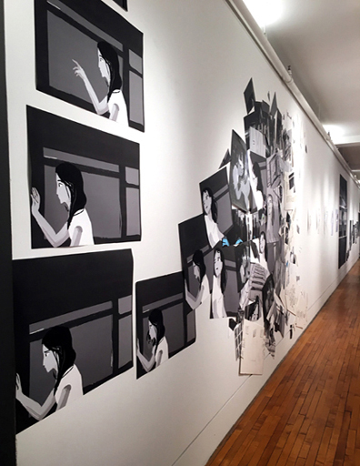
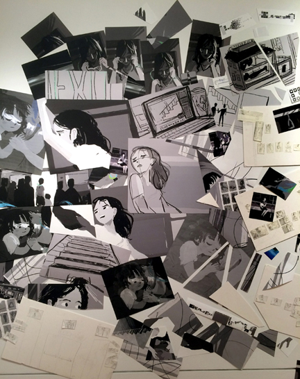 It was very, very cool to have my own show, and to use the gallery space for both art and storytelling (two things I love!)