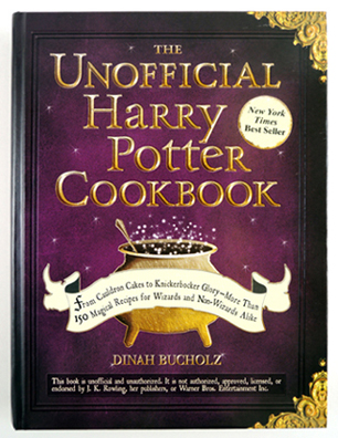
 Harry Potter is celebrating a birthday shortly, which is the only excuse we need to bust out our hats and robes and do something Potter. You might recall our Wand Works event, which included some awesome Flourish & Blotts giveaways. Well, when Katie and I were researching said giveaways, we stumbled across The Unofficial Harry Potter Cookbook by Dinah Bucholz (Adams Media, 2010). Today, we’re going to test a couple recipes from the book. And post reaction shots. In wizard robes.
 The cookbook contains 10 chapters and 150 recipes. While a traditional cookbook organizes its recipes under chapters like main dishes, salads, and sides, the Unofficial Potter has chapters like “Recipes from a Giant and an Elf” (Rock Cakes, Bath Buns, Treacle Fudge, Kreacher’s French Onion Soup, etc.) and “Good Food with Bad Relatives” (Lemon Pops, Knickerbocker Glory, Roast Pork Loin, Mulligatawny Soup, etc.).
The Unofficial Potter is also an interesting education in British cuisine, as recipes for crumpets, kippers, and black pudding are included, among other things. Each recipe in the cookbook is matched to a Harry Potter reference and there are also very interesting bits of culinary history. For example, did you know the first ice cream recipe came to England in the 1600s and King Charles the I swore his cook to secrecy because he wanted to keep the delicious dessert exclusive to royalty? Such a scallywag.
OK! On to the recipe tests! Katie tested 3, and I tested 1. Here we go…
ROCK CAKES, tested by Katie
The recipe for Hagrid’s infamous rock cakes was one of the first I spotted in The Unofficial Harry Potter Cookbook. I couldn’t wait to give it a go and see if they are as delicious as Hagrid claims because we all know he eats them throughout the Harry Potter series. My sous-chef son had been eager to get back into the kitchen with me after our failed attempt at making Monsieur Bon-Bon’s Top Secret “Fooj.” We’ve baked many times together, so we were confident we wouldn’t mess up this recipe!
My sous-chef carefully measured and combined all of the dry ingredients (flour, sugar, baking powder, cinnamon and salt) into a mixing bowl while I prepared the cookie sheet and turned on the oven. After we washed our hands several times, we dove into mixing the butter into the dry ingredients.
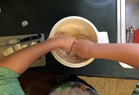 It didn’t take long before the use of our fingertips turned into the use of our full fingers (and some of our hands) in order to make sure we fully incorporated the butter into the dry ingredients.
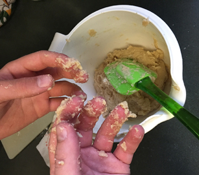 After folding the egg and milk into butter mixture, we slowly mixed in the raisins. This was the only time we both grew concerned about the rock cakes. The batter seemed really thick and tough to mix. After a short while, my son didn’t have the strength to fold in the raisins so he passed the spoon over to me. Even I had a hard time making sure the raisins were fully mixed in!
Once we both determined the raisins were well combined, we dropped the dough onto the cookie sheet. We skipped using a tablespoon to measure the dough size and just eye-balled the amounts. There was a small amount of batter leftover that my son used for his own personal “teeny tiny” rock cake.
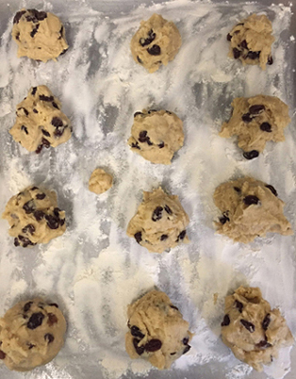 We slid the cookie sheet into the oven for 25 minutes, turning the sheet once in the middle of the baking cycle. Once the rock cakes were lightly brown on the bottom, we pulled them out and set them on racks to cool. The next morning, Dr. Dana and Marissa’s office test confirmed…the recipe is a winner!
 Rock cakes have the appearance and consistency of a scone, so they would be perfect as a morning treat with a cup of coffee or eaten in the afternoon with a spot of tea. My son and I brainstormed other filling options to use in place of raisins and we came up with dried fruits, such as cranberries, cherries or blueberries, chocolate chips, or perhaps just including a splash of vanilla extract to the dough. You could also skip adding anything and eat plain rock cakes with a pat of butter and glob of your favorite jam or jelly.
In honor of Hagrid, Dr. Dana and I set one rock cake aside and let it harden for over a week to see what would happen. It was hard, though not as hard as a rock because Ian was able to take a bite and not break a tooth. I deem the rock cakes recipe worthy of trying in your kitchen!
ACID DROPS tested by KATIE
Confident from our success with the rock cakes, my sous-chef and I moved onto another intriguing recipe: acid drops. Poor Ron Weasley had a hole burned in his tongue when his mischievous brother, Fred, gave him one to try. What would happen to us?
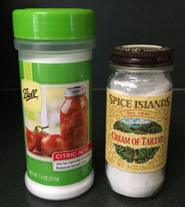
I had most of the necessary ingredients already, but I did have to hunt down cream of tartar, which I discovered in the spice aisle, and citric acid, which was kept with the accessories needed for home canning.
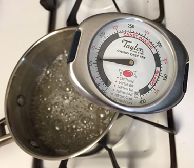
 As I lined two baking sheets with parchment paper, my son measured and combined the water, sugar, and cream of tartar in a small pot. He asked for help with the corn syrup as it looked to him to be hard to measure correctly. I happily obliged to avoid a sticky syrupy mess. We followed the directions carefully, stirred the mixture constantly and used a candy thermometer once our concoction was bubbling. We watched the candy thermometer slowly rise in temperature, stirring every once in a while.
 All was going well until the mixture reached a temperature of about 250 degrees Fahrenheit. That’s when I noticed our whitish clear blend suddenly started turning brown.
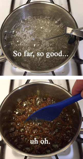 There was also a distinguishable burning smell being emitted from the pot. I knew this was not good, but we decided to follow through until the mixture was at 300 degrees Fahrenheit, per the recipe. Once it hit that temperature, I turned off the burner and we added the citric acid. As soon as the mixture had cooled and stopped bubbling, we took turns dropping teaspoon sized circles of the candy onto the baking sheets.
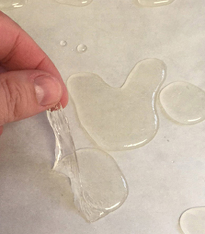
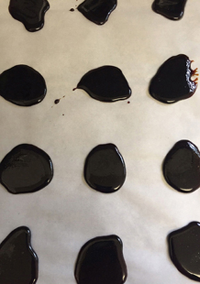 Total fail. Acid drops are supposed to be yellow or yellowish-white, not dark brown almost black. The smell of the candies also reaffirmed what I already knew: the sugar had scorched and the candies were a bust. On a dare, Dr. Dana tried one of the burned candies. I think this image says it all.
 Attempt #2. I consulted Google to find suggestions or ideas from others who have suffered similar fates with their candy. Apparently sugar is very easy to burn, so you have to be cautious when your mixture starts getting close to reaching 300 degrees Fahrenheit. Armed with this new information, I set forth to try again.
I think I may have pulled the mixture off the burner too soon because it didn’t harden into candy. It was congealed and looked like white, stringy amoebas when I dropped it onto the baking sheets.
 Not wanting to give up, I tried the recipe for a third time. Did I finally find success? Maybe.
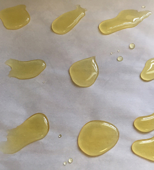 The third candy attempt definitely had a yellow appearance, smelled like lemons, and hardened into round-ish discs. The acid drops were sour to the taste, but not overly sour like I had expected. What we didn’t anticipate was once we put the acid drops into our mouths, the candy adhered itself entirely to our teeth! It was quite alarming. Here are Dr. Dana and Ian captured at the very moment the acid drops adhered to their enamel like a vise:
 My takeaway from trying to make acid drops is that I’m a baker, not a candy maker. I offer a round of applause to those who can make candy because, alas, it is proven that I cannot. I’ll officially hang up my candy maker hat and leave the job to Honeydukes.
TRIPLE POWER ICY LEMON POPS tested by KATIE
My sous-chef son was thrilled when we found the lemon pops recipe in The Unofficial Harry Potter Cookbook because he has a wicked sweet tooth (like his mother) and he absolutely loves anything with lemons. He’s been known to steal lemon slices from my water glass and eat them raw without making a funny sour face.
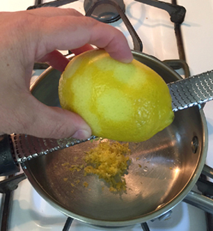
The only ingredient that I didn’t already have in my kitchen for the lemon pops was lemon extract, which I found in the spice aisle at our local grocery store. I took care grating the zest of our lemon directly into the saucepan, making sure to not add any of the white rind because that could cause the lemon pops to have a bitter taste.
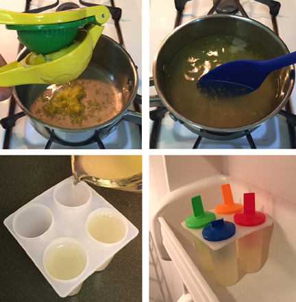
 My sous-chef squeezed the juice out of the zested lemon using our handy lemon/lime press, and then he added the sugar and water to the pan. After bringing the mixture to a simmer, we turned off the heat and added the lemon extract. We let the mixture cool down a bit before pouring it into our popsicle molds, then we placed the molds into the freezer.
 Many hours later, we gave the lemon pops a taste. Delicious! The combination of the lemon zest, juice and extract along with the added sugar gave the lemon pops a nice sweet and sour flavor that almost tasted like limoncello liquor. But trust me when I say that these popsicles were absolutely alcohol free.

Two hardy thumbs up for the Triple Power Icy Lemon Pops! We agree with Harry Potter, these popsicles are quite good!
CHOCOLATE PUDDING tested by DR. DANA
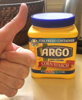
I tested something chocolate. Are you shocked? Specifically, I tested the chocolate pudding recipe in the chapter entitled “Delights Down the Alley.” We have food allergies in my house – including eggs – so pudding is usually off-limits. I was thrilled that, unlike most pudding recipes, this one was eggless! The binding agent is cornstarch.
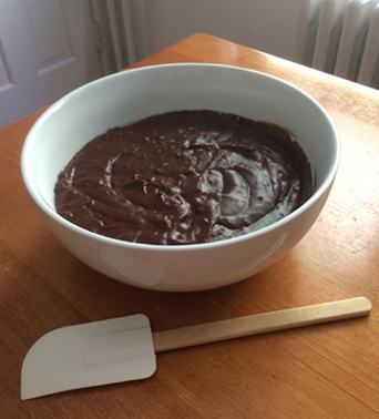
 I won’t send you process photos because Katie’s stove is way cleaner than mine. But I will say that this recipe is straightforward, easy, and can be made in a single pot. The ingredients are sugar, unsweetened cocoa, cornstarch, milk, cream, butter, bittersweet chocolate, vanilla, and a pinch of salt. Though simple, there is a bit of cooking magic involved in the final stove top stage – the recipe transfigures from a chocolate liquid to a thick, velvety pudding. Mmmmm.
The recipe says to strain the pudding into a bowl (I’m guessing to catch some of the inevitable lumps). But I don’t have a strainer, so I skipped that step. The pudding was a tad lumpy, but not enough to bother me or my extraordinarily picky children. Here’s a shot of the pudding before it headed into the fridge to set. Note the magic wand in front of the bowl.
 How does the Unofficial Potter pudding taste? Awesome. The milk, cream, and butter in the recipe make it rich, but not too heavy. The consistency is great too. Very smooth and creamy. Ian had a taste and found the chocolate pudding to be quite…bedazzling.

We only scratched the surface of the Unofficial Harry Potter Cookbook, but we really liked it! It’s a fantastic blend of British dishes, culinary history, and astute references to the dishes and desserts served in the Harry Potter books. It’s clear the author is either a fan of the books, a very good researcher, or both! If you are a Harry Potter fan who likes to cook, or if you are ready for some hands-on experience with meals in the wizarding world, add this book to your collection!

 In the world of crafting, just about anything can be adjusted, changed, or redone according to your budget, staffing, and audience. In fact, adaptation is one of the things I love about developing craft projects for kids. Today, I’m going to show you how I took a simple project and made it even simpler and less expensive for a large-scale event. I’ll throw in a couple hints about running large-scale event tables to boot.
 The project was already easy to assemble, but since we needed to produce 200 pairs of wings, the art supplies were a problem. We made 4 cost-saving changes:
 Notice how we just did a rough cut of the wings (meaning we left each pair on a single strip of paper instead of cutting them out individually)? This is event pointer #1: Prep Up to a Point. Rather than cutting out 200 pairs of wings before the event, we let 200 event participants cut the wings themselves. This definitely saved us prep time, and spared us some wicked hand cramps. Another event pointer? Present the Project.
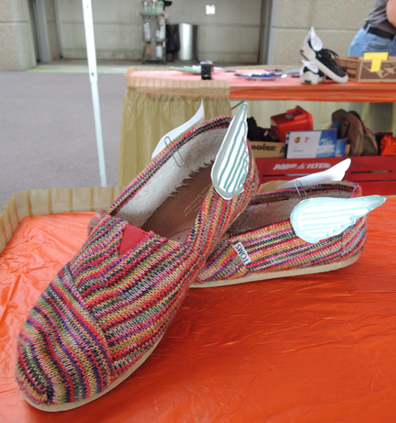 Always have an example of the finished project on the table, so matter how simple it is. That way, you can show kids (and their grown-ups) exactly what they’re aiming to create. If you’re lucky, they’ll be able to get started the project just by looking at the finished version (which will also save you having to explain it 200 times). Next event pointer: Set Up a Self-Cleaning Table.
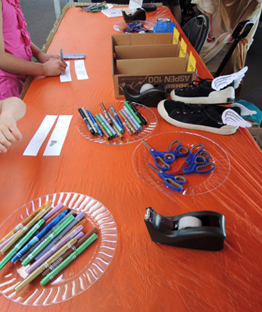 Event tables get crowded quickly, and supplies fly everywhere. However, I find that when supplies are on paper or plastic plates, the plates actually encourage people to return the supplies to their proper places. I don’t know what is it – the plates are wide and flat? They’re super obvious? Impossible to toss something at and miss? Whatever the reason, with plates I spend 75% less time cleaning up the table. And that’s huge when you’re staffing a table for 4 or 5 hours. Pointer #4: Table Skirts are a Good Thing.
 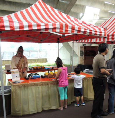 Table skirts are an inexpensive way to make your event table look more finished. They also hide all the unattractive supply boxes you need to stash under your table, as well as your purse or backpack. OK. My final event pointer. Costumes are Awesome.
 And speaking of adaptation, people made a couple project adjustments of their own at the event! A lack of straps on the backs of one’s sandals? Quickly remedied with tape:
 Not into the paper clip part of the project? Tape, once again to the rescue:
 Some skipped the shoe part and simply taped the wings to the backs of their shirts!
 Do you see how the wings are attached to the back of the shirt with black masking tape? That’s another project modification we came up with. Kids without socks (or kids who might be bothered by the paper clips rubbing their feet) were offered masking tape to cover the section of paperclip inside their shoes. It worked great, and it gave the wings a little extra reinforcement too.
 Looking for other event table projects that have worked for us? Check out these pom-pom cannons, Cheshire Cat grins, magic quill pens, and Digitopolis’ number mines. You’ll also find more ideas on our Simple Projects Pinterest board.
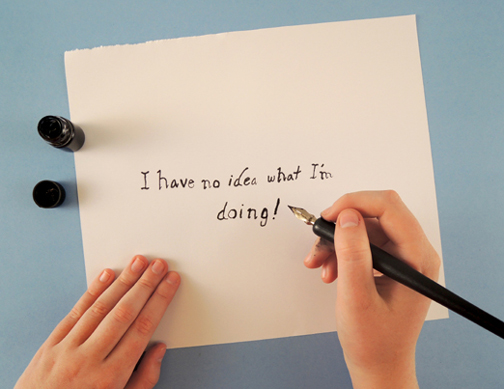 We are truly honored to bring an old friend back to the blog today. Remember Hope, our kid tester? The last time we saw her, she was testing
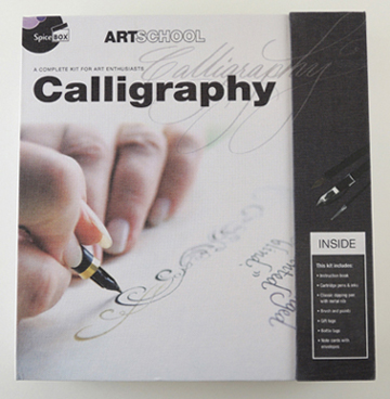
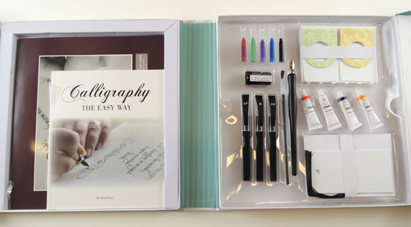 The kit includes: 1 instruction book, practice paper, 3 cartridge pens (xtra fine, medium, and xtra bold), 5 ink cartridges (red, green, purple, blue, and black), 1 classic dipping pen with metal nib, 1 small bottle of black ink, 4 tubes of gouache (red, white, blue, orange), 1 paint brush, 4 gift tags, 4 bottle tags, and 8 note cards with envelopes. After reading the extensive list of supplies included in the kit, I searched the exterior of the box, the interior of the box, the instruction manual, and pretty much everywhere else for a suggested age range for the product…
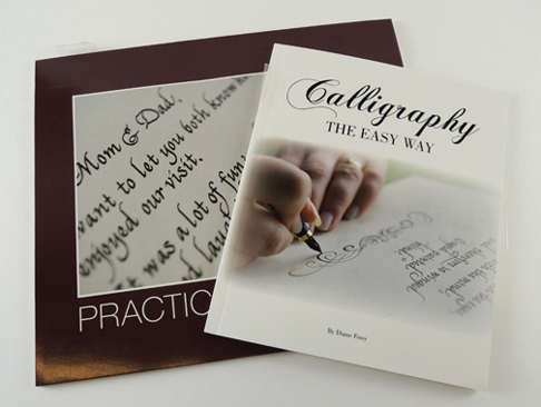 Upon opening the instruction booklet, which was titled Calligraphy the Easy Way by Diane Foisy, I was pleasantly surprised to find a ten page history on calligraphy’s origins, purpose, and more recently, its decline, and those who are attempting to keep the art form alive.
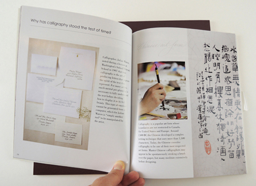 With the ending of that section, in bold letters, it said “History has shown us that calligraphy will prevail.” I’m not sure about you, but to me that sounded a bit sinister, a bit secret society-ish. There was nothing exactly wrong with the statement itself; it just felt a bit chilling for a craft kit instruction booklet.
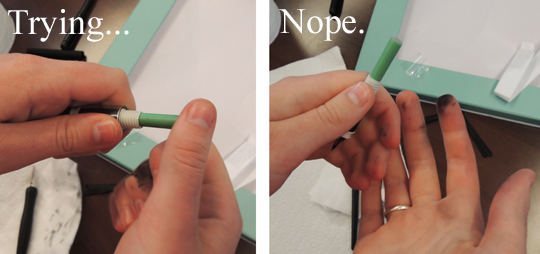 On that page, it also mentioned directions for using a “classic stylus”… nowhere else in the kit is this mentioned. Perhaps it is referring to the “classic dipping pen,” but if so, that was not made clear.
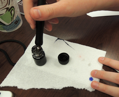
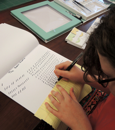 Needless to say, I was not very adept at creating even these simple lines. When I was making these lines on the practice paper provided, the ink went right through the paper. When it did not go through the paper, it bled on the surface of the paper, so it did not make clean lines like those pictured in the booklet.
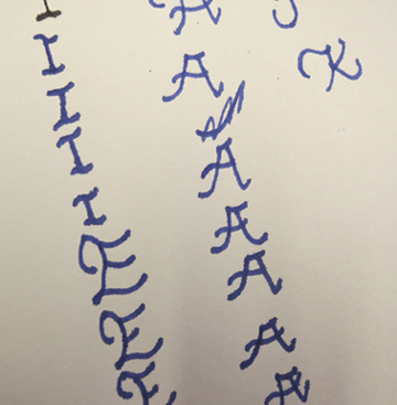
 The booklet ended with a brief piece about the history of illumination, a type of medieval calligraphy done mostly by monks, and a few pages of flower templates that the author encouraged you to copy and use in your own designs.
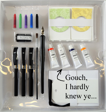
 I was so excited to use this product to make something beautiful with calligraphy, but instead I felt inadequate and mocked by the instruction manual. I should’ve been the one mocking the inadequate instruction manual. Since it was called (and I quote) an “instruction book,” I felt that I should have been instructed, not loosely guided by numbers and arrows. On the plus side, I gained a new appreciation for Charles Dickens’ incredibly long novels because he had to write them with one of these pens!