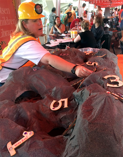
 Welcome to the number mines of Digitopolis, the famous kingdom from The Phantom Tollbooth! This fall, we hosted a table at Princeton University’s annual Community & Staff Day event. Big crowds meant that we needed something simple, but we wanted to be creative too. Since we had successfully offered the number mines at a massive math event last spring (you can read about it here and here), we decided to bring them back for more numerical fun.
Alas, the original number mine (which was artfully constructed by the Arts Council of Princeton) wasn’t salvaged after the math event. This meant that Katie and I had to build our number mine from scratch. The first part of this post describes how we ran the event table. The second part describes how we build the mine.
At the event, kids would reach into the number mine and pull out a plain wooden number. I bought the numbers online from Woodcrafter, where they range in size, thickness, price, and font. I got the 4″ numbers that were 1/8th of an inch thick. Each number cost 56¢.
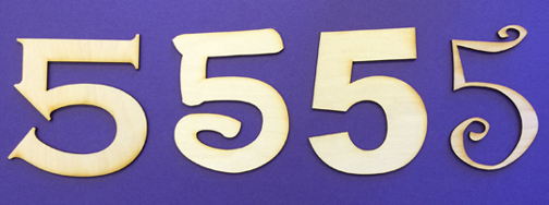 We found that 4″ was a great size for decorating, but if 56¢ per piece is outside your budget, you can go smaller. A 1″ number of the same thickness, for example, costs 23¢. Or, if you want to go even cheaper, skip the wood and print your numbers on white card stock. We loaded the numbers into the mine, and the kids “dug” them out with their hands.
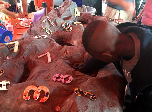 Once kids found a number they liked (7 and 8 were very popular), they went over to the number decorating area, which was stocked with metallic makers, glitter markers, small gemstones, and glue. We had a relevant quote from the book on display too. Kids really got into decorating. One little girl spent 25 minutes working on her number!
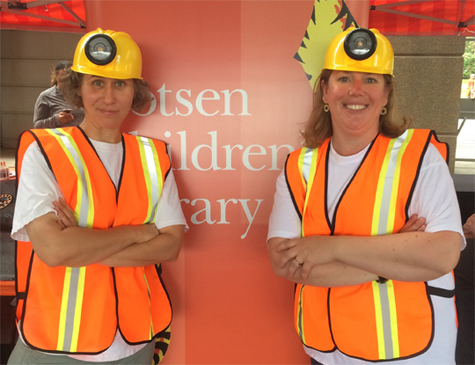
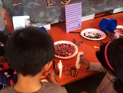 Note! If you use squeeze glue (as opposed to hot glue) make sure to have paper towels or small paper plates handy so families can safely transport their numbers home. Hand wipes are also a good idea for sticky fingers and tabletops. Katie and I dressed for the occasion in miner’s helmets and safety vests.
 So, that’s our event table…now for constructing the mine! You certainly don’t have to get as elaborate as we did. You can create a mine by covering a box with grey paper. Cut a hole in the box’s lid, throw some numbers in there, and have kids reach into the box! Or you could skip the mine altogether and just do the number decorating part of the project. But if you do want to build a mine, here’s how we did it.
STEP 1
Find a big, flat box that isn’t too deep. You don’t want kids to have to reach too far down for the numbers – especially the little ones. We used a 34″ x 54″ inch box lid, and then attached 6 photo storage boxes to the bottom using hot glue and packing tape. This resulted in a mine that was 5″ deep. Here’s a shot of the underside.
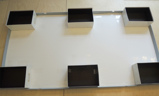 Since the box lid didn’t reach all the way to the bottom of the photo storage boxes, we closed the gap by attaching big strips of corrugated cardboard to 3 sides of the mine. We left it the mine open in the back so we could restock numbers during the event.
STEP 2
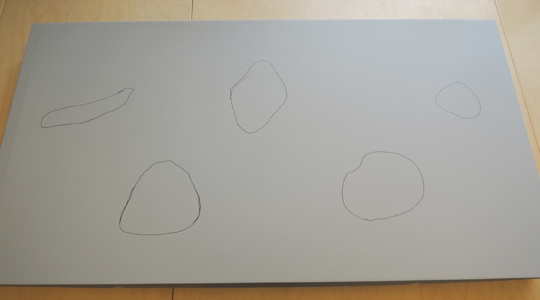
Cut holes in the top of the box. We found it helpful to draw the holes before we started cutting. That way, we could be sure we weren’t cutting into any of the support boxes and we knew that the numbers would fit through the holes.
STEP 3
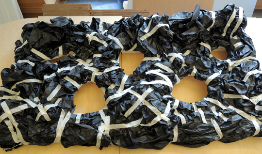
Create the rocky, craggy landscape of your mine. We bunched up big pieces of black bulletin board paper and attached them to the box with masking tape.
STEP 4
Now for the really, really messy part. Papier-mâché. We don’t have a sink in our work space, and the nearest bathroom is far, far away. So we wanted to create the smallest mess possible. In other words, we didn’t want to cook, mix, or blend any sort of papier-mâché paste (or dilute any glue). After a little research, we settled on liquid starch.
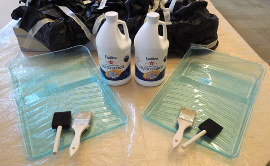
Below are our tools – 2 enormous jugs of liquid starch, 2 plastic roller trays, and 4 paint brushes (the bristle brushes worked better than the foam ones). Oh, and we also put a plastic tarp under the mine so we wouldn’t ruin the table.
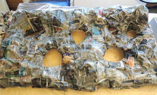
 Since we had a lot of area to cover, we used big, 6″ x 16.5″ pieces of newspaper. Occasionally, we use a smaller strip for edges or crevices, but mostly we stuck with the big ones.
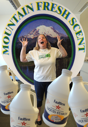
 The liquid starch held up well! It did coat our hands with sticky residue that required multiple rounds of soap and scrubbing to remove, but it wasn’t too bad. Honestly, the worst thing about the liquid starch was the fact that it was scented. “Mountain Fresh” scent to be exact. Hoo boy. You could smell the mountains the minute you took the cap off. After a couple minutes, the fragrance was looming in the room like a big, ominous fog. Katie put together a little graphic to convey the overpowering Mountain Freshness.
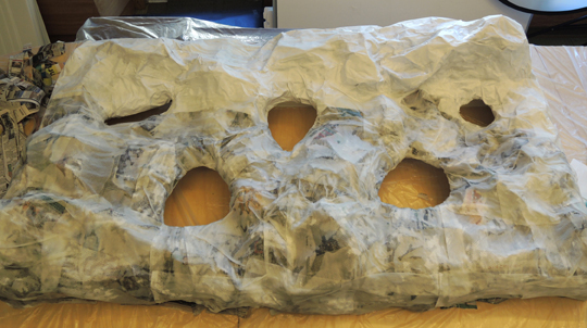
 We left the first layer to dry overnight. For the second layer, we got a little experimental. While researching liquid starch, we learned that some people absolutely rave about using white paper towels and computer printer paper for papier-mâché projects, especially if the projects are going to be painted later. So we decided to give it a try. We papier-mâchéd the bottom of the mine with paper towels, and the top portion with computer printer paper.
 Wow, did the paper towels suck up the liquid starch! The printer paper needed much less. But the printer paper was so stiff, it created unwanted gaps like this one:
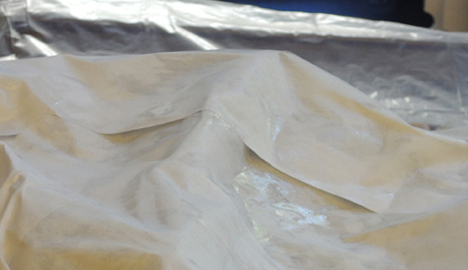 The solution was to drape a liquid starch-soaked paper towel over it. Below is that same gap with the paper towel over it. As you can see, the soft paper towel completely obscures the gap. I didn’t officially test this, but I believe newspaper would obscure gaps as well, perhaps even better than the paper towels.
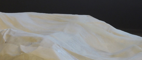 I was a little worried the paper towels were too transparent. But overnight, they magically dried to solid white.
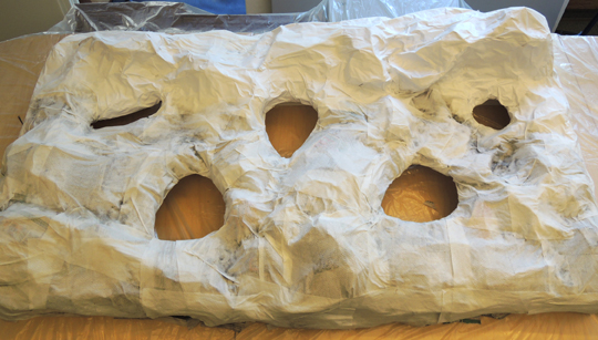 In the above photo, you can see there were still wet patches in crevices where the liquid starch had pooled. Katie hit those with a hair dryer, no problem. And we should add that, even now, things were still smelling quite Mountain Fresh.
STEP 5
Time to paint! We used this awesome textured-stone effects spray paint by Valspar. It’s fun, but pricey ($10 a can at Lowe’s). Our mine required 3 cans.
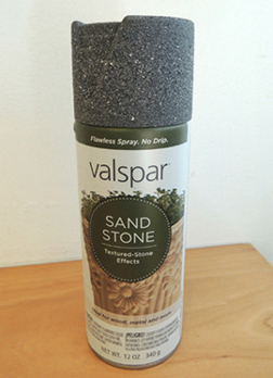 A cheaper option would be to use gray paint to cover the mine, then dab on darker gray with a piece of sponge. This will get you a textured surface, without the hefty spray paint price. Once the spray paint had dried (which, we might add, finally dissipated the Mountain Fresh fragrance), we decorated some numbers and attached them to the mines with hot glue. We hot glued some large plastic gems on as well – purchased from the wedding favor aisle at Michaels Craft Store.
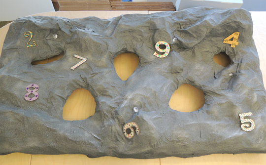 And this, dear readers, is when we discovered the fatal flaws in regards to paper towels:
- When dry and spray painted, paper towels become incredibly brittle. I poked a hole right thorough one section while merely tapping on it (we eventually covered the hole with the number 8).
- The texture of the paper towel absolutely comes through in the end. So if your paper towels have little hearts embossed on them, you’re going to see little hearts under the paint.
- The edges of the paper towels are clearly defined. Unlike the newspaper and the printer paper, you can definitely see the edges of the paper towel under the paint. So our rocky surface looked like, well, draped paper towels. You could even see the dotted perforations that separate the paper towels.
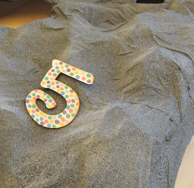 The printer paper, on the other hand, was much sturdier and the edges were hidden under the paint. The lesson? DON’T use paper towels for papier-mâché projects. Use newspaper and printer paper instead. In fact, I highly recommend printer paper for the second layer of painted papier-mâché projects. Very sturdy, holds paint very well.
However, paper towels are what we used and their brittle weakness made me and Katie very, very nervous. We were positive that kids were going to put their hands right through the mine as they leaned in to select numbers.
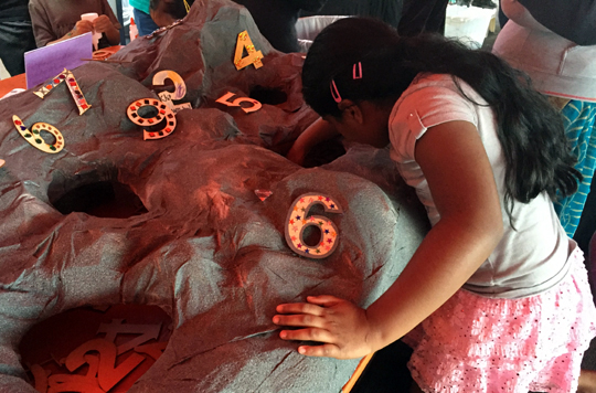 Anticipating trouble, we brought duct tape and a couple of step stools to the event. The stools elevated the kids right up to table level, allowing them to keep their weight mostly on the stools and not on their hands. So the paper towels held, but there were a couple time you could see them bending. Katie and I would brace ourselves for a tearing, crunching, breaking sound. Thankfully, it never happened. Whew!
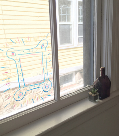
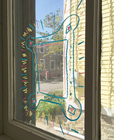
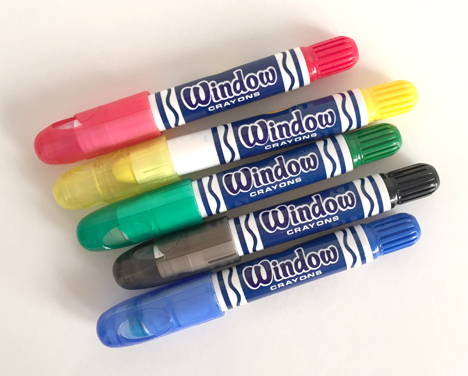 However, I also tested regular markers (Target’s washable brand for under $4) and they work on the glass too (and most importantly, cleaned right OFF with a standard glass cleaner, no problemo).

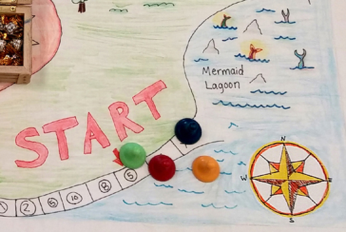 “Check this out!” Katie said to me one morning, holding up her phone. “My friend just posted this to her Instagram!” It was a board game, based on the book Hatchet, designed by Quinn Densmore, a 5th grader in New Mexico.
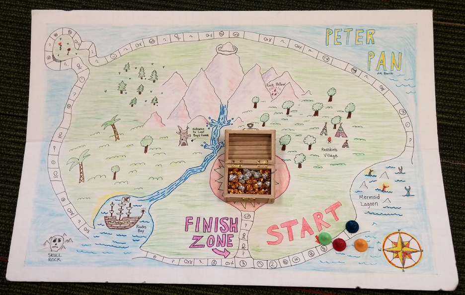
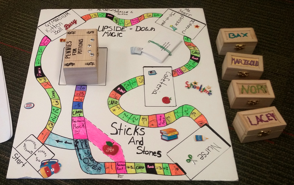 The goal of this game is to get rid of as many gems as you can before reaching the finish line (i.e. the “Pennies for Potions” square). No small feat considering that each player starts with 50 gems! As you travel the board, you can either gain or lose gems depending on the space you land on and the cards you draw.
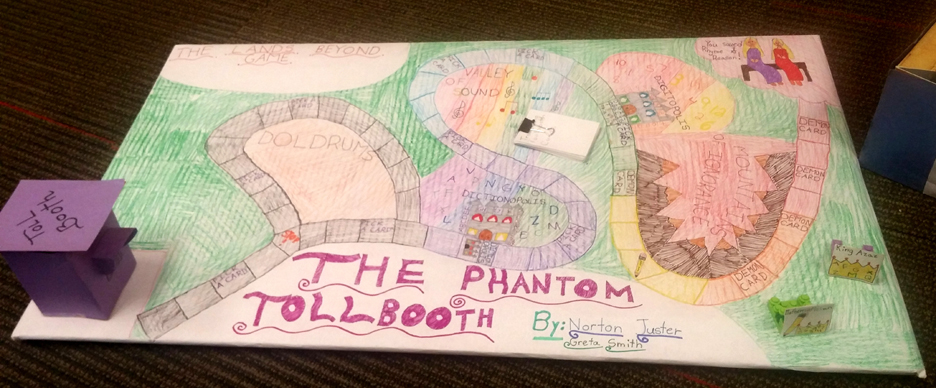 Based on The Phantom Tollbooth, players begin at the tollbooth but soon encounter the Doldrums. If you roll a 1,3, or 5, you get stuck on the Doldrums. If you roll a 2,4, or 6 you take another path. The game continues to move forward in this quirky fashion, and also includes directional cards that make you stop or allow you to roll again. Waiting at the finish line, of course, are Princesses Rhyme and Reason.
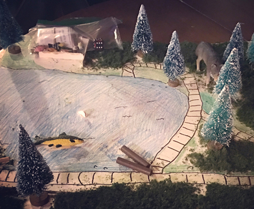 The object of this game is to get rescued from the wilderness. As you move around the board, you acquire different cards. If you get a fire card you are immune to 1 hypothermia card. If you get hit by a disaster, you must do what the card instructs (move back, lose a turn, etc.). If you get a rescue card, you are safe from the next attack card. Collect 5 rescue cards, and you win!
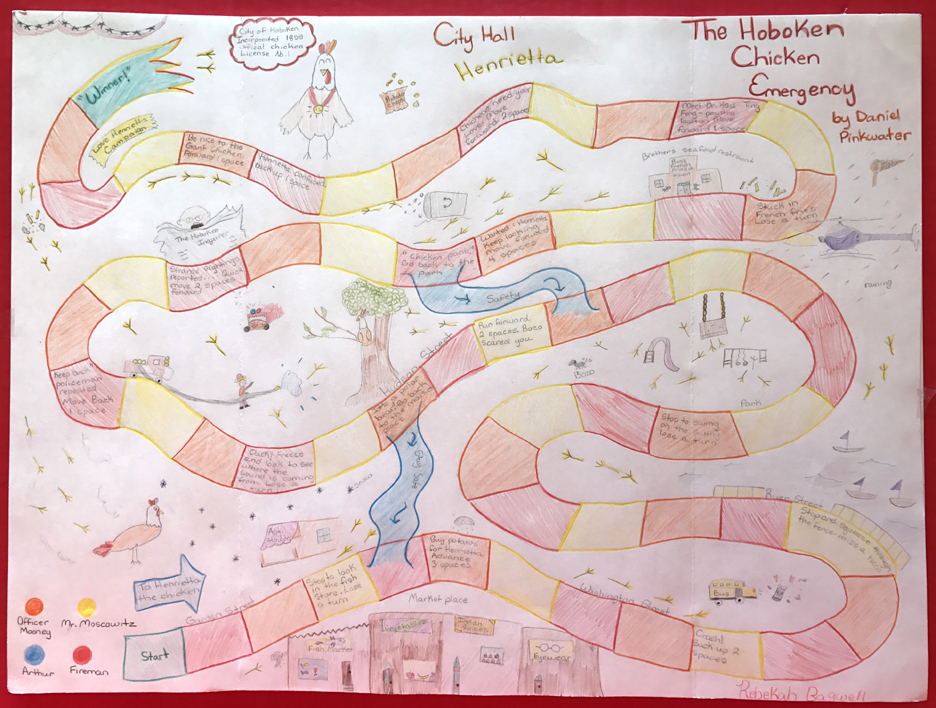 I’ve been a Daniel Pinkwater fan since I was 9, so I was thrilled to see this classic book turned into a game. Players race each other to Hokoben City Hall. Along the way, they must follow the directions on each space (if they land on a blank space, they just wait until their turn comes up again). The winner gets to take home a little Henrietta as a pet!
 Welcome to the number mines of Digitopolis, the famous kingdom from The Phantom Tollbooth! This fall, we hosted a table at Princeton University’s annual Community & Staff Day event. Big crowds meant that we needed something simple, but we wanted to be creative too. Since we had successfully offered the number mines at a massive math event last spring (you can read about it
  We found that 4″ was a great size for decorating, but if 56
 Once kids found a number they liked (7 and 8 were very popular), they went over to the number decorating area, which was stocked with metallic makers, glitter markers,
  Note! If you use squeeze glue (as opposed to hot glue) make sure to have paper towels or small paper plates handy so families can safely transport their numbers home. Hand wipes are also a good idea for sticky fingers and tabletops. Katie and I dressed for the occasion in miner’s helmets and safety vests.
 So, that’s our event table…now for constructing the mine! You certainly don’t have to get as elaborate as we did. You can create a mine by covering a box with grey paper. Cut a hole in the box’s lid, throw some numbers in there, and have kids reach into the box! Or you could skip the mine altogether and just do the number decorating part of the project. But if you do want to build a mine, here’s how we did it.
 Since the box lid didn’t reach all the way to the bottom of the photo storage boxes, we closed the gap by attaching big strips of corrugated cardboard to 3 sides of the mine. We left it the mine open in the back so we could restock numbers during the event.

 Since we had a lot of area to cover, we used big, 6″ x 16.5″ pieces of newspaper. Occasionally, we use a smaller strip for edges or crevices, but mostly we stuck with the big ones.
 The liquid starch held up well! It did coat our hands with sticky residue that required multiple rounds of soap and scrubbing to remove, but it wasn’t too bad. Honestly, the worst thing about the liquid starch was the fact that it was scented. “Mountain Fresh” scent to be exact. Hoo boy. You could smell the mountains the minute you took the cap off. After a couple minutes, the fragrance was looming in the room like a big, ominous fog. Katie put together a little graphic to convey the overpowering Mountain Freshness.
 We left the first layer to dry overnight. For the second layer, we got a little experimental. While researching liquid starch, we learned that some people absolutely rave about using white paper towels and computer printer paper for papier-mâché projects, especially if the projects are going to be painted later. So we decided to give it a try. We papier-mâchéd the bottom of the mine with paper towels, and the top portion with computer printer paper.
 Wow, did the paper towels suck up the liquid starch! The printer paper needed much less. But the printer paper was so stiff, it created unwanted gaps like this one:
 The solution was to drape a liquid starch-soaked paper towel over it. Below is that same gap with the paper towel over it. As you can see, the soft paper towel completely obscures the gap. I didn’t officially test this, but I believe newspaper would obscure gaps as well, perhaps even better than the paper towels.
 I was a little worried the paper towels were too transparent. But overnight, they magically dried to solid white.
 In the above photo, you can see there were still wet patches in crevices where the liquid starch had pooled. Katie hit those with a hair dryer, no problem. And we should add that, even now, things were still smelling quite Mountain Fresh.
 A cheaper option would be to use gray paint to cover the mine, then dab on darker gray with a piece of sponge. This will get you a textured surface, without the hefty spray paint price. Once the spray paint had dried (which, we might add, finally dissipated the Mountain Fresh fragrance), we decorated some numbers and attached them to the mines with hot glue. We hot glued some large plastic gems on as well – purchased from the wedding favor aisle at Michaels Craft Store.
 And this, dear readers, is when we discovered the fatal flaws in regards to paper towels:
 The printer paper, on the other hand, was much sturdier and the edges were hidden under the paint. The lesson? DON’T use paper towels for papier-mâché projects. Use newspaper and printer paper instead. In fact, I highly recommend printer paper for the second layer of painted papier-mâché projects. Very sturdy, holds paint very well.
 Anticipating trouble, we brought duct tape and a couple of step stools to the event. The stools elevated the kids right up to table level, allowing them to keep their weight mostly on the stools and not on their hands. So the paper towels held, but there were a couple time you could see them bending. Katie and I would brace ourselves for a tearing, crunching, breaking sound. Thankfully, it never happened. Whew!