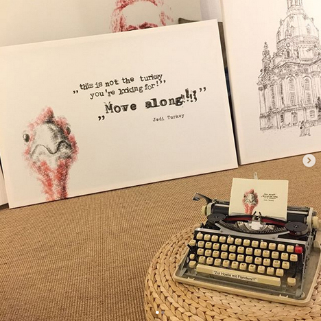
Daily, we lay our fingers on our QWERTY keyboards. But while we type out words, German artist Robert Dörfler conjures portraits, buildings, animals, and landscapes. An artist with a mechanical easel and alphabetic brushes, his
Instagram is both fascinating and unexpected. I was delighted to catch up with Robert to chat about his amazing process…
How did this interesting art form develop for you?
As a child I played around with my sister’s electric typewriter, doodling little stickmen in tiny landscapes while laying out make-believe newspaper pages. As time marched on I forgot about doing things like that and began to learn programming and playing different musical instruments. Back in the old pre-Windows days of widespread text-based home computer use, people might occasionally encounter illustrations up on the screen made out of text characters — called ASCII art! — and I thought that it looked like fun. I made several pictures in that style, some of which even won art competitions!
But one day I came across other specimens of the older typewriter art again and realised that there might be some logical connection between the two styles, figuring that some ASCII art techniques could be applied to the typewriter, and I could apply what I had learned from the newer style to the older… with mixed success. Of course, the paper page isn’t limited to columns and rows the way a fixed-width screen of text is on a computer, so you can still manage to go outside of the box and push boundaries outside a strict grid even typing with straight lines.
Typewriter drawing can feel like you’re using some analogue Photoshop with layers and a wide range of colours, except of course without any “undo” function for erasing mistakes that might come up.
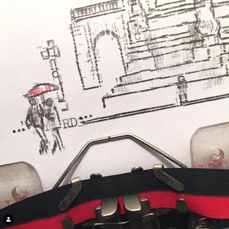 How do you translate landscapes and buildings to typewriter keys?
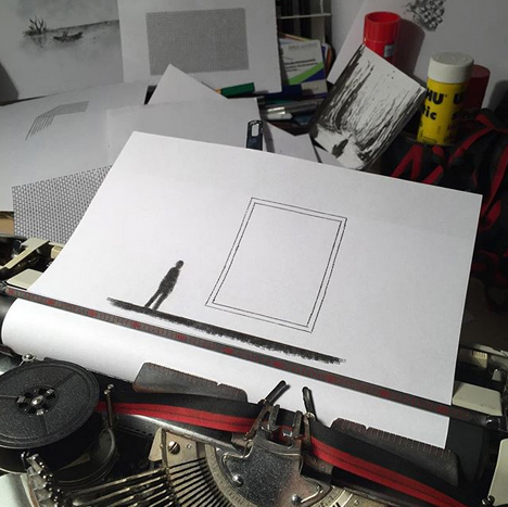
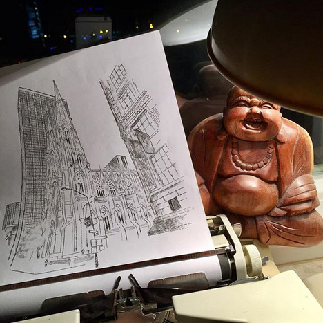
There are a number of ways to adapt an image, depending on the aesthetic style you’re hoping to achieve. You could make a picture simply by typing a single key over and over again, but an easy technique for building up an illustration is to sketch it out like an artist might do with a pencil in their notebook: every building has edges that could first be translated into lines by typing exclamation marks for vertical or dashes for horizontal lines. Slanted edges such as rooftops could be typed with a slash or, if it is available, the backslash.
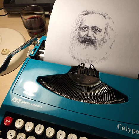
 What is the most difficult thing about creating a piece?
Maybe the most difficult part is simply getting a new picture started without knowing how much further work — sometimes weeks’ worth! — remains ahead until it is completed. To be honest it all depends on what the typist is aspiring to achieve in terms of the look of the piece. For instance, I like to type portraits to look as realistic as possible, and that just might be the most difficult thing for me… because if it doesn’t look the way I’m hoping for, I just start over again and again and again. I’ve learned to begin with the eyes, because I always want them to look perfect, and many times I’ve almost finished lovely portraits and then ruined everything typing in the eyes wrong.
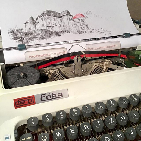
 What brands of typewriters do you use?
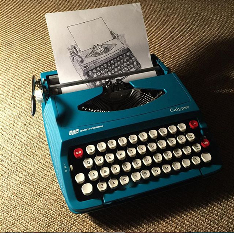
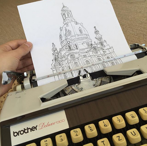
My favourite typewriter is a Brother Deluxe 1300 that is actually already so broken that it can’t even be used to compose a letter, as every capital letter is out of place. Usually I like to stick to the typewriters of my homeland like those made by Continental or the so-called “Erika” typewriters from Saxony in Germany. It may not be obvious, but every typewriter has its own distinct typeface and so they aren’t all just interchangeable for different applications. I also enjoy using my Olympia Traveller with its Cyrillic typeface — the Russian alphabet has dense letters that can turn a lot of blank space black just by typing a single letter!
 Name your top 5 typewriter keys to use, and tell us why!
I can’t quite get it down to five, but here are seven of the keys I use the most: _ . – ! and ` for drawing outlines, and % and m fill space like nobody’s business. Ding!
Images courtesy of Robert Dörfler
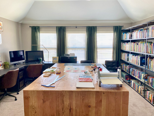
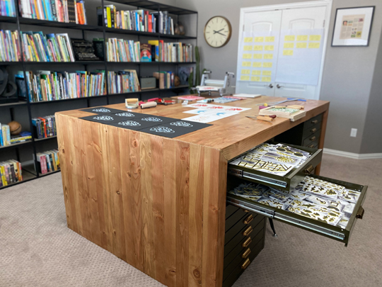 Photo 2: We keep our flat file storage under the bench. We use some of the drawers for storing supplies, but mainly, they store all the stamps and prints we make for every project we do.
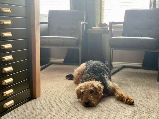 Photo 3: This is Whiskey. She’s our studio assistant. Her primary duty is to lie down right in the way so we’re constantly almost tripping as we move around the space. She keeps us on our toes.
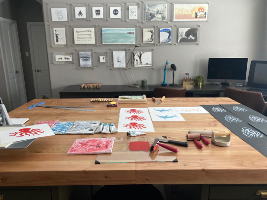 Photo 4: We like to be surrounded by the work of creators we admire, so on one wall Jarrett has a collection of original art from illustrator friends and favorites.
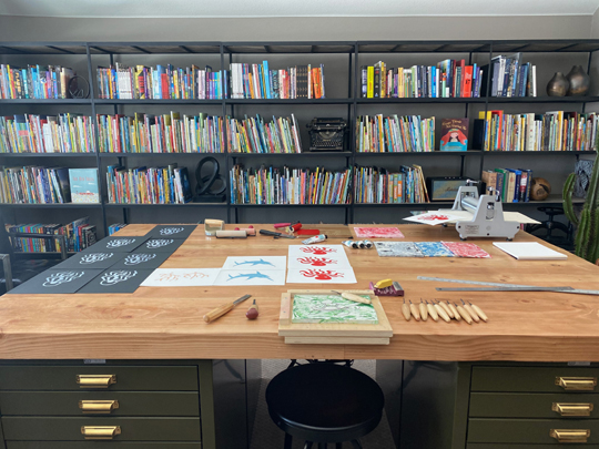 Photo 5: And then on the opposing wall, he has a library of books.
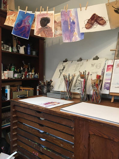 Today, we’ll be visiting Barbara DiLorenzo, a New Jersey-based illustrator, writer, and teacher! Her books include Renato and the Lion (Viking Books, 2017) and Quincy: The Chameleon Who Couldn’t Blend In (Little Bee Books, 2018). In addition to this, Barbara has gone skydiving, hang gliding, surfing, and whitewater rafting. YES! In 2019, we were delighted to invite her to our library to read, make
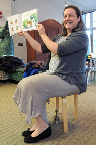
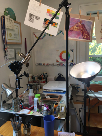
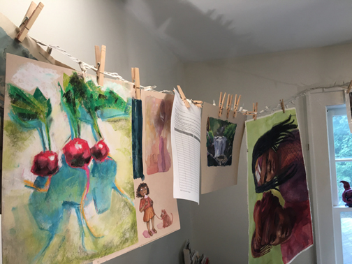 I sit at this desk and Zoom teach art classes – hence the big light and mic stands to hold cameras. I’m a messy artist, so I have to clean up frequently. Otherwise the clay and paint would be all over the keyboard and mouse.
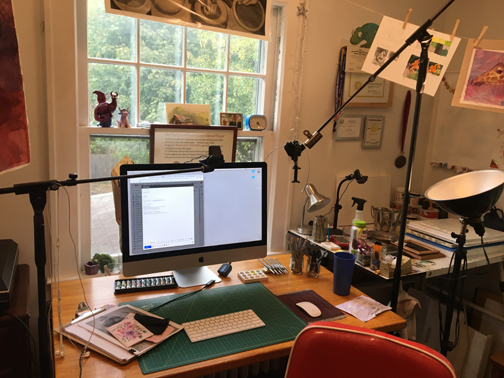 This is another angle of this area – showing that one whole drafting table is covered in paint and other supplies. Even vitamins. Those are important!